Contract Analyzer Series — Blog 5: Legal-Tech Frontend & AI Trust UX#
The last mile of an AI pipeline is the UI.
I had a working backend by Saturday evening. The extraction prompt from Part 2 was returning 41 clause classifications in one Claude call. The scoring from Part 3 was collapsing them into a coherent risk number. The SSE stream from Part 4 was delivering progress events to the browser. I wired up a React frontend using Vite defaults, added Tailwind, pulled in Inter, built a few components — and stepped back.
It looked like every AI demo ever posted on Twitter. White cards, Inter font, purple accent button. And then I remembered who this was for: lawyers, procurement officers, compliance managers. Professionals whose job is to be paid skeptics. They don't trust "looks like a weekend AI demo" tools with six-figure contracts. The packaging was saying "toy."
Design for an AI product aimed at professionals is a trust problem, not an aesthetic problem. The UI is where trust is established or killed, before anyone reads a word of AI output. The rest of the stack is load-bearing only if the UI convinces a skeptical user to act on the results.
This post covers the design system — navy + gold palette, Cormorant serif, the custom SVG risk gauge, dark/light theme with Tailwind v4 — and the grounding UX patterns (Document Viewer, expandable clause rows) that let users verify every AI claim against the source contract.
 The dark landing. Serif display type, navy atmosphere, warm gold accents — designed to signal "this product understands legal work" before anyone reads a word.
The Contract Analyzer Series#
| Part | Title | Focus |
|---|---|---|
| 1 | Architecture & The $40K Problem | System design, CUAD taxonomy, tech stack, pipeline |
| 2 | Clause Extraction with Closed-Vocabulary Prompting | Prompt engineering, 41 clause types, defensive JSON parsing |
| 3 | Risk Scoring & the Two-Call LLM Pipeline | Multi-stage orchestration, grounding, persona engineering |
| 4 | Streaming Progress with Server-Sent Events | SSE over POST, keepalives, AI UX for perceived latency |
| 5 | Legal-Tech Frontend & AI Trust UX (this post) | Design for skepticism, grounding, SVG gauge, dark/light theme |
Why Frontend Design Is an AI Trust Problem#
Generic AI interfaces have a pattern: white cards, Inter or Roboto, purple gradient button, rounded-xl corners. None of those choices are wrong — they produce functional interfaces. The problem is that every AI product in the market has converged on this exact aesthetic, and the look has become a signal: "this is a GPT wrapper someone built between Slack messages."
That signal is usually correct. Which means users have correctly learned to use the visual vocabulary as a proxy for quality. A lawyer reviewing a contract worth $2 million isn't going to look at a purple gradient and think "this will change my practice." They're going to think "I'm not staking my malpractice insurance on it."
The fix isn't "prettier." The fix is trust signaling through distinctive design — a visual vocabulary that tells the user, before they read a single word, that the people who built this understand what legal work actually is. Every design choice should be answering the question: does this look like something a lawyer would trust?
A purple gradient on white answers "no." The direction I committed to — judicial authority meets Bloomberg Terminal — answers "maybe."
The Design Direction: Legal-Tech Aesthetic#
The visual direction is dark navy + warm gold for the default theme, cream paper + deep navy ink for the light theme. Each choice is domain-language signaling.
Gold is the color of legal seals, parchment gilt, and judge's chamber nameplates. Navy is courthouse wood paneling, certified documents, law firm letterhead. Together they communicate serious institution in a way that teal-on-white or purple-on-white does not.
The typography stack is three fonts with distinct roles:
| Role | Font | Why |
|---|---|---|
| Display headings, brand | Cormorant | Serif authority. Reads as letterhead, court filing, law review. |
| Body text, buttons, navigation | Outfit | Geometric sans, generous spacing. Modern without being generic. |
| Numbers, tabular data | JetBrains Mono | Bloomberg Terminal feel. Signals "this is professional data." |
Cormorant is a genuinely distinctive display serif — its italic is beautiful and its character spacing at display sizes reads as editorial, not playful. Outfit is a deliberate rejection of Inter: same geometric-sans family, but wider letter spacing and more distinctive terminals. A reader notices subconsciously: "someone chose this." JetBrains Mono for numerics is the Bloomberg Terminal move — when a risk score reads 31 in mono, it signals data, not marketing copy.
The Color System#
Here's the full dark-theme palette, defined in the Tailwind v4 @theme block:
@theme { /* Surfaces — deep navy stack */ --color-navy-950: #050a18; /* Deepest page background */ --color-navy-900: #0a1628; /* Primary surface */ --color-navy-850: #0d1a30; /* Card background */ --color-navy-800: #111d35; /* Elevated surface */ --color-navy-750: #16243f; --color-navy-700: #1a2744; --color-navy-600: #243356; /* Subtle borders */ --color-navy-500: #2f4066; /* Stronger borders */ /* Text — muted slate for body, paper-white for headings */ --color-slate-450: #6b7c9e; /* Most muted */ --color-slate-400: #8b9dc3; --color-slate-300: #a8b8d8; --color-slate-200: #c5d1e6; /* Primary body text */ --color-slate-100: #e0e7f2; --color-paper: #f0f4fa; /* Headings, maximum brightness */ /* Gold — warm accent */ --color-gold-600: #b8923f; --color-gold-500: #d4a853; /* Primary gold */ --color-gold-400: #e8c468; --color-gold-300: #f2d688; --color-gold-100: #fdf4dc; /* Risk levels — semaphore traffic lights */ --color-risk-low: #34d399; /* Emerald */ --color-risk-medium: #fbbf24; /* Yellow */ --color-risk-high: #fb923c; /* Orange */ --color-risk-critical: #f87171; /* Red */ }
A few notes on the decisions. Eight shades of navy, not three — enough to put the page at navy-950, content at navy-900, cards at navy-850, elevated surfaces at navy-800, and still have room for borders and hover states. Subtle gradation creates depth. A three-shade interface registers as "flat" and, from there, "basic."
Slate body text instead of white — #c5d1e6 on navy reads softer, closer to ink on paper. I reserve paper (#f0f4fa) for maximum-contrast headings only. The gold at #d4a853 is desaturated and warm — it reads as antique gilt, not highlighter. And the risk colors are chosen to remain distinguishable for color-blind users on navy.
The Risk Gauge: A Custom SVG Visualization#
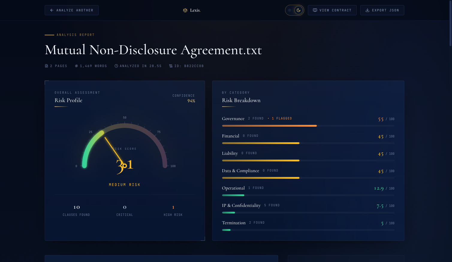 The Risk Overview. The gauge shows the score (31), the label ("Medium Risk"), and a confidence metric ("Confidence: 94%"). Color gradient communicates severity at a glance.
The risk gauge is the hero component on the dashboard. I surveyed Recharts, Chart.js, Nivo, and D3 — none of them produced what I had in my head: a semi-circular arc with a green-to-red gradient, tick marks, numeric labels, and an animated needle sweeping from 0 to the final score. I built it from scratch in roughly 150 lines of SVG + React + Framer Motion.
The math is geometry. Given center (centerX, centerY), radius r, and a score 0-100:
// Score 0 is at 180° (left), score 100 is at 0° (right) const scoreAngle = 180 - (score / 100) * 180 const scoreRadians = (scoreAngle * Math.PI) / 180 const endX = centerX + radius * Math.cos(scoreRadians) const endY = centerY - radius * Math.sin(scoreRadians)
The arc is a single SVG path using the arc-to A command. The gradient runs green-to-red across the full semicircle:
<defs> <linearGradient id="gaugeGradient" x1="0%" y1="0%" x2="100%" y2="0%"> <stop offset="0%" stopColor="#34d399" /> {/* emerald */} <stop offset="40%" stopColor="#fbbf24" /> {/* yellow */} <stop offset="70%" stopColor="#fb923c" /> {/* orange */} <stop offset="100%" stopColor="#f87171" /> {/* red */} </linearGradient> </defs> <path d={`M ${centerX - radius} ${centerY} A ${radius} ${radius} 0 0 1 ${centerX + radius} ${centerY}`} fill="none" stroke="url(#gaugeGradient)" strokeWidth={16} strokeLinecap="round" />
That A command: A rx ry x-axis-rotation large-arc-flag sweep-flag x y. For a semicircle from left to right over the top, large-arc-flag=0 and sweep-flag=1.
The animation. Three things animate simultaneously over 1.6 seconds: the arc fills, the needle sweeps, the number counts up.
The arc fills using Framer Motion's pathLength:
<motion.path initial={{ pathLength: 0 }} animate={{ pathLength: score / 100 }} transition={{ duration: 1.6, ease: [0.16, 1, 0.3, 1], delay: 0.3 }} d={`M ${centerX - radius} ${centerY} A ${radius} ${radius} 0 0 1 ${centerX + radius} ${centerY}`} fill="none" stroke="url(#gaugeGradient)" strokeWidth={16} strokeLinecap="round" />
pathLength interpolates from 0 to 1, and animate={{ pathLength: score / 100 }} draws exactly as much of the arc as the score represents. The ease curve [0.16, 1, 0.3, 1] is a custom cubic-bezier — fast-out, slow-in — so the arc whips forward and settles gently.
The number counts up using a Framer Motion spring:
const spring = useSpring(0, { stiffness: 60, damping: 18 }) const displayNumber = useTransform(spring, (v) => Math.round(v)) useEffect(() => { spring.set(score) }, [score, spring])
All three animations fire together. The needle sweeps, the arc fills, the number climbs — 1.6 seconds from start to resolution. A static score that appears instantly feels like a guess. A score that resolves through animation feels like a calculation. That perception is a trust signal: "the AI was thinking, and this is what it settled on."
Showing Your Work: The Document Viewer#
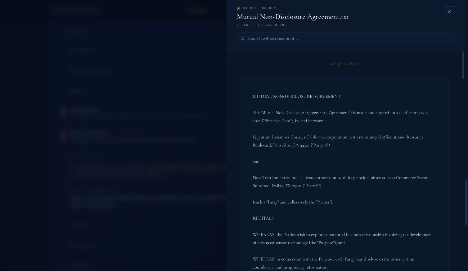 The Document Viewer drawer. One click from any dashboard state, the full contract text opens in a slide-over. Users can verify any AI claim against the source.
The Document Viewer is the most important feature in the app, added two hours before I called the project done.
Here's the feature: a "View Contract" button in the dashboard header slides a drawer in from the right showing the full raw text of the uploaded contract — Cormorant serif at 15px, 1.75 line-height, warm tones — with a search field. The user can scroll, search, copy, and cross-reference every AI claim against the actual source.
AI-generated analysis is only useful if users can verify it. When Claude says "this contract has a highly unfavorable limitation of liability clause," a skeptical professional's next question is "show me where you got that from." If the app can't answer, the user either trusts blindly (bad) or dismisses the output and re-reads the contract themselves (defeats the purpose). Neither is acceptable.
The Document Viewer is the answer to "show me where you got that from." It's explainability as UX — a path from any AI claim back to the original evidence.
Three design properties matter:
- One click away. Not buried in a sub-menu. Friction between claim and source destroys the verification loop.
- Slide-over, not navigation. The user shouldn't lose their place in the analysis when they verify a claim. The dashboard stays visible underneath.
- Typography matches a printed document. Cormorant serif, generous line-height, warm tones. The user feels like they're reading the contract.
If you build an AI product where users will act on the output, you need this pattern — a way to step from any AI conclusion back to the raw material the AI saw. Citations in a RAG answer, a "show source" button on a summary, highlighted spans on the original text. The specific form varies. The principle is invariant: if the user can't check the source, they can't trust the output.
Expandable Clause Rows#
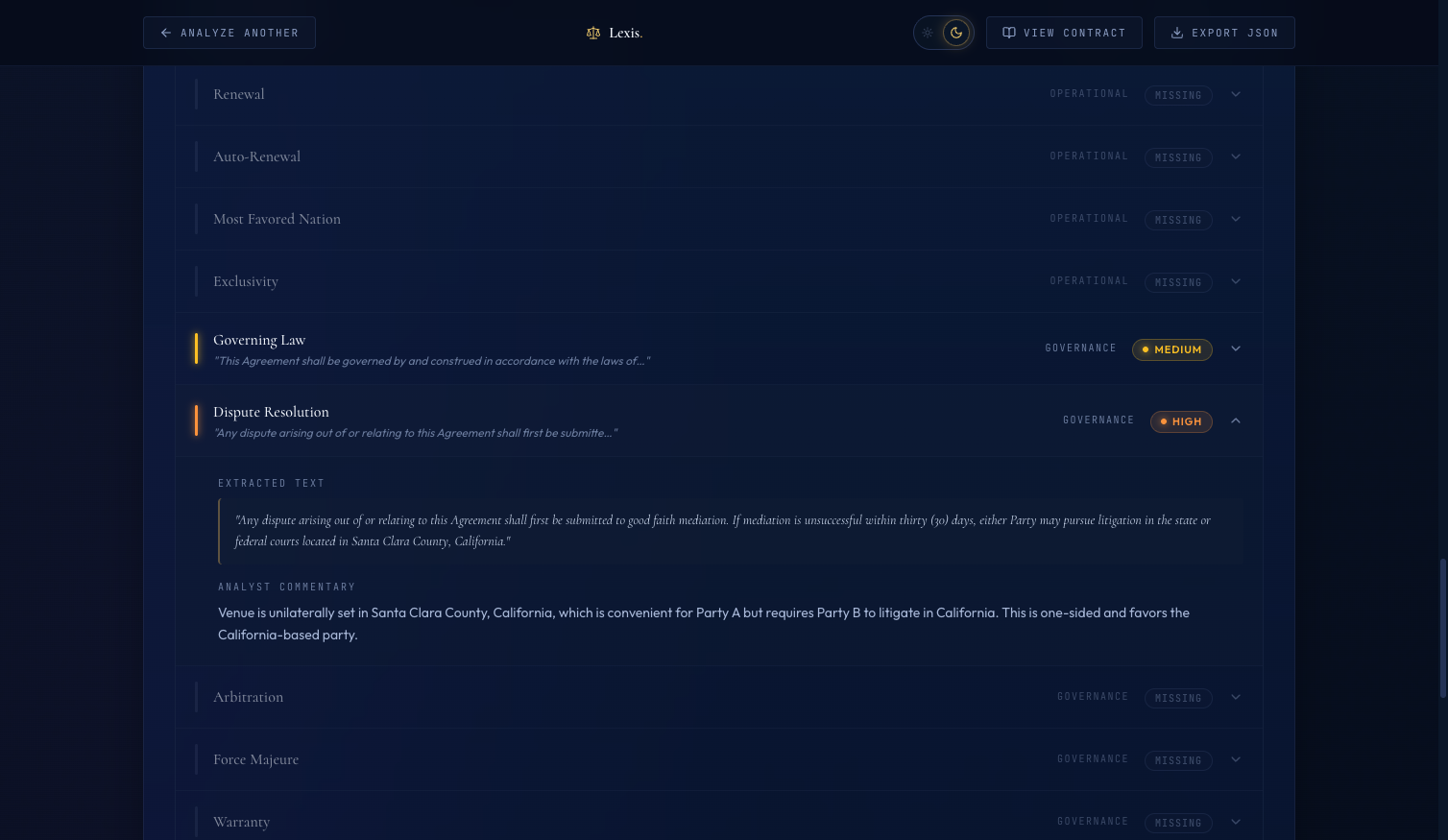 An expanded clause row. The gold-bordered pullquote is the exact text the AI extracted. Below it, the AI's commentary explains the classification.
The clause table lists all 41 CUAD clauses with their classification, risk level, and a short commentary. Clicking any row expands it to reveal two things:
- The exact excerpt from the contract — the specific text the AI pulled as evidence for its classification, set in a gold-bordered pullquote in Cormorant serif
- The AI's commentary — a short paragraph explaining why it classified the clause this way
This is the "AI made a claim — here's the source text" pattern applied inline. The verification loop takes five seconds: AI asserts something, user clicks to expand, user reads the excerpt alongside the reasoning, user decides whether they agree. Without it, the user has to trust blindly or re-read the entire contract. With it, they can calibrate trust clause by clause.
One other detail: when the AI's extraction fails, I don't hide it. Failed clauses show up in the table as "Unable to analyze — extraction failed." Visible failures are better than silent degradation. A professional who discovers later that failures were hidden will never trust the product again. A professional who sees failures flagged clearly will think "at least this thing is honest about its limits."
Dark & Light Theme with Tailwind v4#
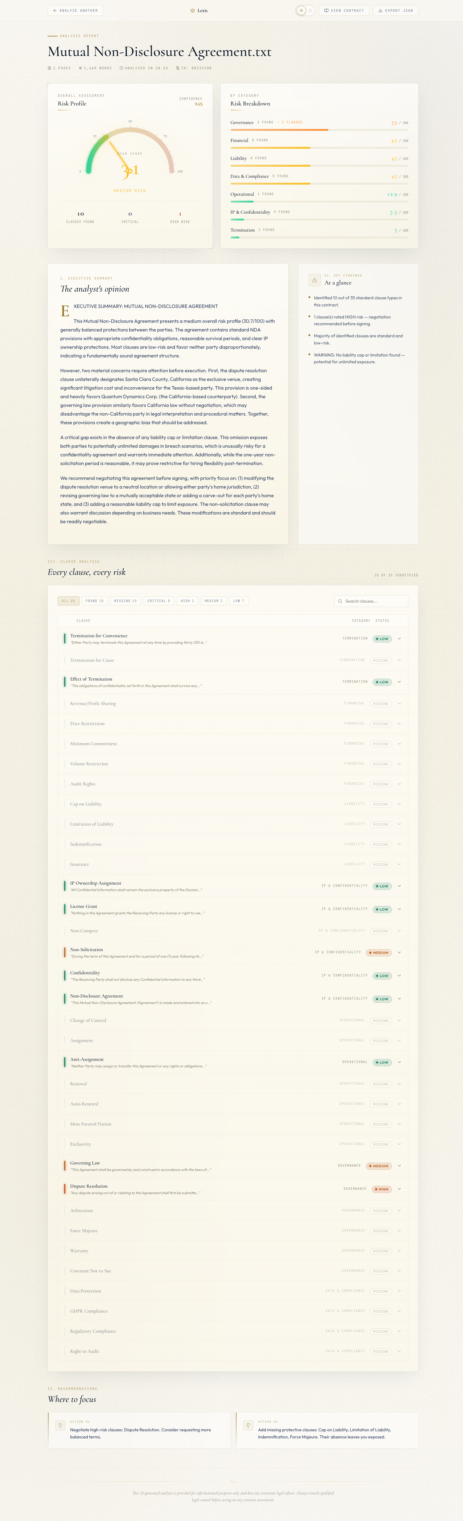 The light theme. Cream
 #faf8f2 background with warm gold accents. The metaphor shifts from "Bloomberg Terminal" to "law firm letterhead."
The naive light mode approach — invert everything to white and black — produced something terrible. Cold white cards on bleach-white backgrounds with navy text. It looked like a medical records system from 2008.
The insight: legal-tech light mode should look like paper, not a screen. Law firm letterhead. A printed brief. Cream pages with navy ink and gold seals.
Here's the light theme palette:
:root.light { /* Surfaces — cream paper */ --color-navy-950: #faf8f2; /* Warm off-white page background */ --color-navy-900: #ffffff; /* Brightest surface */ --color-navy-850: #f8f5ec; /* Subtle cream card bg */ --color-navy-800: #ffffff; /* Elevated white */ --color-navy-750: #f3efe3; --color-navy-700: #e7e1cf; /* Cream borders */ --color-navy-600: #d4ccb5; --color-navy-500: #b5ad93; /* Text — deep navy ink */ --color-paper: #0a1628; /* Deep navy, maximum contrast */ --color-slate-100: #1a2744; --color-slate-200: #2d3e5f; /* Primary body text */ --color-slate-300: #475569; --color-slate-400: #64748b; --color-slate-450: #8a8775; /* Muted warm gray */ /* Gold — darker for contrast on cream */ --color-gold-600: #7a5f1a; --color-gold-500: #96772a; /* Main accent */ --color-gold-400: #a8863b; --color-gold-300: #b8923f; --color-gold-100: #f5ebc8; /* Risk colors — darker for light bg readability */ --color-risk-low: #047857; --color-risk-medium: #b45309; --color-risk-high: #c2410c; --color-risk-critical: #b91c1c; }
The key decision: #faf8f2 has a yellow tint that reads as aged paper instead of blank screen. The risk colors are darker in light mode because the default dark-theme values disappear on cream — I learned this by flipping the theme and watching my risk badges vanish.
The theme switch is a Tailwind v4 CSS variable override. Because Tailwind v4 compiles bg-navy-900 to background: var(--color-navy-900), changing the variable at :root.light re-themes every component using that token automatically — no JSX changes, no dark: prefixes.
export function useTheme() { const [theme, setTheme] = useState<Theme>(getInitialTheme) useEffect(() => { const root = document.documentElement if (theme === 'light') { root.classList.add('light') } else { root.classList.remove('light') } localStorage.setItem('lexis-theme', theme) }, [theme]) const toggleTheme = useCallback(() => { setTheme((t) => (t === 'dark' ? 'light' : 'dark')) }, []) return { theme, toggleTheme } }
Toggle the class on <html>, persist to localStorage, every Tailwind utility re-evaluates. The design decision that felt like a week of refactoring turned into a twenty-line hook and a CSS block.
The SVG Hardcoded Color Bug#
I shipped the light theme, clicked the toggle, and the upload view looked beautiful. Then I analyzed a sample contract and the dashboard appeared.
The risk gauge's tick marks were gone. The number labels were gone. The background arc was gone.
Everything else had switched to cream correctly — cards, text, borders. But the gauge was a partial skeleton: the animated score arc was there, the needle was there, but the tick marks and labels had vanished.
I opened DevTools. The SVG elements were in the DOM. They were rendering. Their strokes were set to rgba(168, 184, 216, 0.3) — a pale slate designed to read on dark navy. On cream, it's invisible.
SVG stroke and fill attributes set as string literals don't respond to CSS variables. When I wrote:
<line x1={x1} y1={y1} x2={x2} y2={y2} stroke="rgba(168, 184, 216, 0.3)" strokeWidth={isMajor ? 1.5 : 1} />
...the stroke attribute is a fixed string. No way for it to pick up theme tokens.
The fix: switch from SVG attribute values to Tailwind utility classes.
<line x1={x1} y1={y1} x2={x2} y2={y2} className="stroke-slate-450" strokeOpacity={0.4} strokeWidth={isMajor ? 1.5 : 1} />
className="stroke-slate-450" compiles to stroke: var(--color-slate-450). That variable is different in light and dark themes, both visible on their respective backgrounds. Same fix for tick labels (className="fill-slate-400") and the background arc (className="stroke-navy-600").
After the fix, the gauge theme-switches correctly in both modes. I left the gradient stop colors (green-to-red inside the linearGradient) as hardcoded hex values — those colors are semantic to the data, not to the theme. Some colors should stay fixed. The lesson for everything else: when you build custom SVG for a themed app, use Tailwind utility classes for every color, not attribute strings.
Loading State as Trust UX#
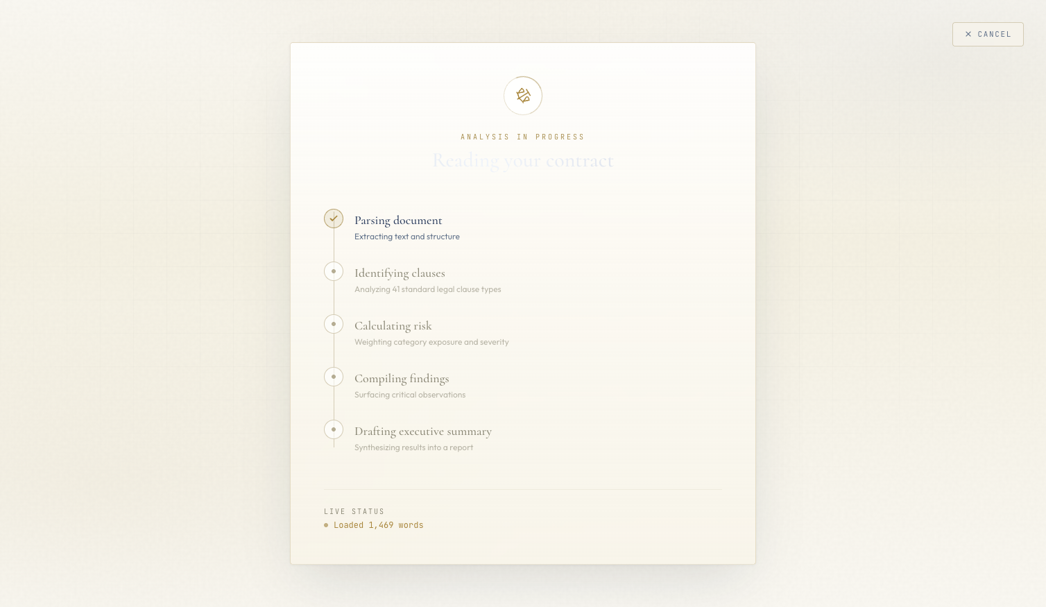 The loading state. Each processing step surfaces in real time — users see what the AI is doing, not just a spinner.
When analysis is running, users see a vertical timeline of processing steps rather than a spinner:
- Extracting text from PDF
- Classifying 41 clause types
- Computing risk score
- Generating executive summary
- Preparing results
Each step updates in real time via SSE. The currently-running step has a pulse animation on its indicator dot. Completed steps check off. The text underneath shimmers with a skeleton animation.
This isn't just aesthetics. It's trust UX for perceived latency. A spinner after a file upload says "something is happening." A step timeline says "here is exactly what is happening and how far along we are." Users who can see the AI working are more patient and more willing to engage with the results. The loading state primes the trust that the results view needs to close.
Real Numbers: Cost Recap#
Running an analysis on a real commercial contract costs approximately $0.005 to $0.010 in Bedrock fees. The traditional cost of a human legal review of the same contract is somewhere around $6,000 to $40,000 depending on firm, complexity, and jurisdiction.
| Metric | AI Pipeline | Human Review |
|---|---|---|
| Cost per contract | ~$0.005 | $6,000 – $40,000 |
| Time per contract | < 30 seconds | 4 – 16 hours |
| Clause types covered | 41 (CUAD taxonomy) | Unlimited |
| Confidence metric | Exposed in UI | Implicit |
| Available 24/7 | Yes | No |
The project is a portfolio demo — it hasn't been malpractice-insured, audited for compliance, or validated against a real legal workflow. But the economics are real: AI handles the repetitive 80% of contract review, returning lawyers to the 20% that actually requires judgment: negotiation strategy, relationship context, precedent analysis. Giving lawyers back the 80% is the value proposition.
What the Series Covered#
| Part | Topic | Key Output |
|---|---|---|
| 1 — Architecture | System design, CUAD taxonomy, tech stack | FastAPI + Claude Haiku 4.5 + SSE pipeline |
| 2 — Extraction | Closed-vocabulary prompting, 41 clause types | Single-call batch classifier, defensive JSON parsing |
| 3 — Risk Scoring | Two-call LLM pipeline, non-linear weights | Deterministic risk score + confidence metric |
| 4 — SSE Streaming | SSE over POST, keepalives, perceived latency | Real-time progress stream through CloudFront |
| 5 — Frontend | Legal-tech design, SVG gauge, dark/light theme | Trust UX: grounding, verification, visible failures |
Thanks for Reading#
That's the full Contract Analyzer series. The project replaces $6,000-$40,000 of first-pass legal review with a Claude Haiku 4.5 pipeline that runs in under 30 seconds for half a cent. Credit to The Atticus Project for CUAD — the 41-clause taxonomy is the single biggest unlock in the entire system.
If you missed earlier posts, the series starts at Blog 1: Architecture & The $40K Problem.
This is post 5 of 5 in the Contract Analyzer Series. The full series covers architecture, clause extraction, risk scoring, streaming UX, and legal-tech frontend design for an AI-powered contract analyzer.
All code is open source: github.com/MinhQuanBuiSco/contract-analyzer