Clinical Research Series — Blog 5: Medical Frontend & Production Readiness#
A research tool for doctors needs more than a chat box. It needs evidence badges, safety alerts, and trial cards.
Generic chat UIs are fine for general-purpose AI. You type a question, the model streams back text. But clinical research has structured data that doesn't belong in a paragraph: evidence levels, PMID citations, credibility scores, trial phases, enrollment statuses, safety flags. Cramming all of that into a markdown response is a disservice to the data. The frontend needs to render each piece of information in its native format — badges for evidence levels, progress bars for credibility, cards for trials, banners for safety alerts.
This post covers the frontend architecture: the design philosophy, the component system, the medical UI patterns, and the production setup that ties the entire Clinical Research Agent together.
The Clinical Research Series#
| Part | Title | Focus |
|---|---|---|
| 1 | Architecture & Domain Analysis | System design, evidence hierarchy, medical APIs |
| 2 | PubMed & ClinicalTrials.gov Integration | E-utilities, v2 API, OpenFDA, circuit breakers |
| 3 | Safety & Hallucination Prevention | Uncited claim detection, credibility scoring |
| 4 | Evidence Grading & Citation Quality | Level I-V, PMID/NCT citations, journal tiers |
| 5 | Medical Frontend & Production Readiness (this post) | Teal theme, EvidencePanel, SafetyAlert |
Design Philosophy: Clinical Intelligence#
The design language is what I call "Clinical Intelligence" — a teal-primary palette that evokes trust and medical professionalism, combined with information density that respects the user's expertise. Doctors don't need hand-holding. They need data, clearly presented.
Color System#
The color palette is built on three principles: teal for trust, severity colors for safety, and the evidence hierarchy spectrum.
| Purpose | Color | Usage |
|---|---|---|
| Primary | Teal | Headers, active states, links, branding |
| Danger | Red | Uncited claims, high-severity safety flags |
| Success | Green/Emerald | Verified claims, Level I evidence, safe citations |
| Warning | Amber | Partially cited claims, Level III evidence |
| Neutral | Gray | Level V evidence, completed trials, muted text |
The evidence level colors follow the hierarchy from Blog 4: emerald (Level I) through blue (Level II), amber (Level III), orange (Level IV), and gray (Level V). These colors are defined once in the EVIDENCE_COLORS map and used everywhere:
const EVIDENCE_COLORS: Record<string, { bg: string; text: string; border: string }> = { I: { bg: 'bg-emerald-500/10', text: 'text-emerald-600 dark:text-emerald-400', border: 'border-emerald-500/25' }, II: { bg: 'bg-blue-500/10', text: 'text-blue-600 dark:text-blue-400', border: 'border-blue-500/25' }, III: { bg: 'bg-amber-500/10', text: 'text-amber-600 dark:text-amber-400', border: 'border-amber-500/25' }, IV: { bg: 'bg-orange-500/10', text: 'text-orange-600 dark:text-orange-400', border: 'border-orange-500/25' }, V: { bg: 'bg-gray-500/10', text: 'text-gray-600 dark:text-gray-400', border: 'border-gray-500/25' }, };
Each level uses a 10% opacity background, full-saturation text, and a 25% opacity border. This creates badges that are visually distinct without overwhelming the card layout. The dark mode variants swap to the 400-weight of each color for readability on dark backgrounds.
The Evidence Panel#
The Evidence Panel is a slide-out sidebar that displays articles and clinical trials alongside the chat. It opens automatically when evidence arrives and stays open so the user can cross-reference articles while reading the response.
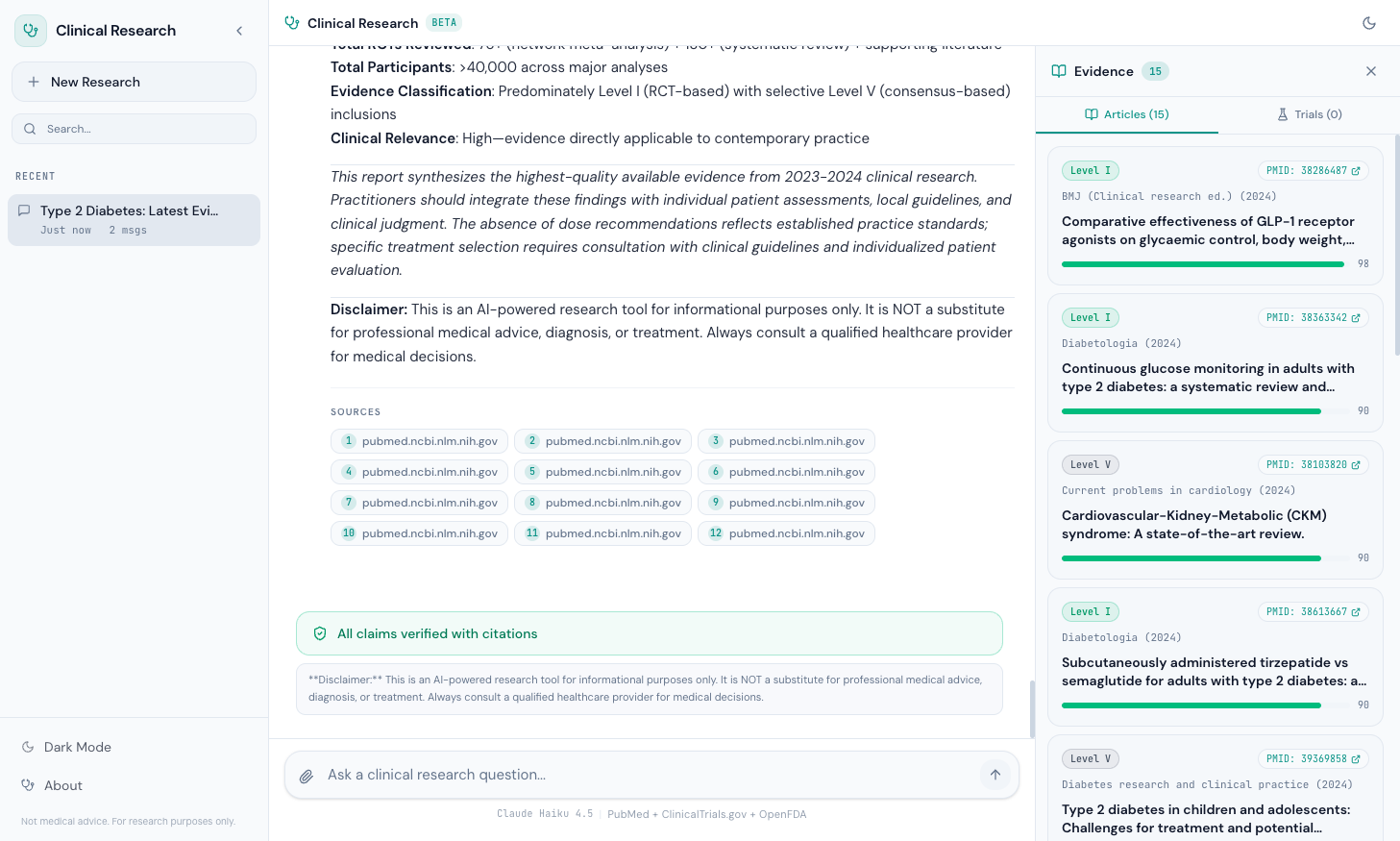
Article Cards#
Each article card displays five pieces of information in a compact layout:
- Evidence Level Badge — "Level I" through "Level V" with hierarchy colors
- PMID Link — Clickable badge linking to
pubmed.ncbi.nlm.nih.gov/{pmid}/ - Journal and Year — Monospace text showing the publication source
- Title — Bold, clamped to 2 lines to prevent card explosion
- Credibility Bar — A progress bar from 0-100 with color coding (emerald >= 80, amber >= 60, red < 60)
function ArticleCard({ article, index }: { article: Article; index: number }) { return ( <motion.div initial={{ opacity: 0, y: 8 }} animate={{ opacity: 1, y: 0 }} transition={{ delay: index * 0.04 }} className="rounded-xl border border-border bg-secondary/30 p-3.5 space-y-2 hover:border-primary/20 transition-colors" > {/* Top row: evidence + PMID */} <div className="flex items-center justify-between gap-2"> <EvidenceBadge level={article.evidence_level} /> <a href={`https://pubmed.ncbi.nlm.nih.gov/${article.pmid}/`} target="_blank" rel="noopener noreferrer" className="inline-flex items-center gap-1 rounded-full border border-border bg-card px-2 py-0.5 text-[10px] font-mono text-primary hover:border-primary/40 transition-colors" > PMID: {article.pmid} <ExternalLink className="h-2.5 w-2.5" /> </a> </div> {/* Journal + Year */} <div className="text-[11px] text-muted-foreground font-mono"> {article.journal} ({article.year}) </div> {/* Title */} <h4 className="text-sm font-semibold leading-snug line-clamp-2"> {article.title} </h4> {/* Credibility bar */} <CredibilityBar score={article.credibility_score} /> </motion.div> ); }
The motion.div wrapper from Framer Motion staggers each card by 40ms (delay: index * 0.04), creating a cascade effect as articles load. The hover:border-primary/20 transition gives subtle feedback without being distracting.
The Credibility Bar#
The credibility bar is a minimal progress indicator that communicates source reliability at a glance:
function CredibilityBar({ score }: { score: number }) { const color = score >= 80 ? 'bg-emerald-500' : score >= 60 ? 'bg-amber-500' : 'bg-red-500'; return ( <div className="flex items-center gap-2"> <div className="h-1.5 flex-1 rounded-full bg-secondary overflow-hidden"> <div className={cn('h-full rounded-full transition-all', color)} style={{ width: `${score}%` }} /> </div> <span className="text-[10px] font-mono text-muted-foreground"> {score} </span> </div> ); }
A NEJM article fills the bar to 98% in emerald. A preprint fills it to 55% in amber. An unverified web source fills it to 40% in red. The numeric score sits next to the bar in monospace for precision.
The Trials Tab#
The Evidence Panel has two tabs: Articles and Trials. The Trials tab renders clinical trial cards with their own set of structured data.
Trial Cards#
Each trial card displays:
- NCT ID Link — Clickable badge linking to
clinicaltrials.gov/study/{nct_id} - Phase Badge — "Phase 1" through "Phase 4" in teal
- Status Badge — Color-coded recruitment status
- Title — Clamped to 2 lines
- Sponsor — Organization running the trial
- Conditions — Tags showing the diseases being studied (max 3 visible)
Status Badges#
Trial statuses get their own color system:
const STATUS_COLORS: Record<string, string> = { Recruiting: 'bg-green-500/10 text-green-600 border-green-500/25', 'Active, not recruiting': 'bg-blue-500/10 text-blue-600 border-blue-500/25', Completed: 'bg-gray-500/10 text-gray-500 border-gray-500/25', 'Not yet recruiting': 'bg-amber-500/10 text-amber-600 border-amber-500/25', };
Green for "Recruiting" (actionable — patients can enroll), blue for "Active, not recruiting" (running but full), gray for "Completed" (results may be available), amber for "Not yet recruiting" (planned but not started). Each color communicates the trial's actionability without the user needing to read the text.
The Safety Alert Component#
The SafetyAlert component renders at the bottom of a research response, after the main content. It has two states:
Safe State: All Claims Verified#
When the hallucination detector finds no uncited claims, the component renders a green banner:
{isSafe && ( <div className="flex items-center gap-2.5 rounded-xl border border-emerald-500/30 bg-emerald-500/5 px-4 py-3"> <ShieldCheck className="h-4 w-4 text-emerald-600" /> <span className="text-sm font-medium text-emerald-700"> All claims verified with citations </span> </div> )}
This is the happy path. Every medical claim in the response has a corresponding PMID, NCT ID, or DOI citation. The green shield icon and emerald border signal trust.
Unsafe State: Flagged Claims#
When the safety system detects uncited or partially cited claims, each flag renders as an individual alert with severity coloring:
const SEVERITY_CONFIG = { high: { icon: ShieldAlert, label: 'Uncited medical claim detected', className: 'border-red-500/30 bg-red-500/5 text-red-700 dark:text-red-400', }, medium: { icon: AlertTriangle, label: 'Partially cited claim', className: 'border-amber-500/30 bg-amber-500/5 text-amber-700 dark:text-amber-400', }, low: { icon: Info, label: 'Minor citation gap', className: 'border-blue-500/30 bg-blue-500/5 text-blue-700 dark:text-blue-400', }, };
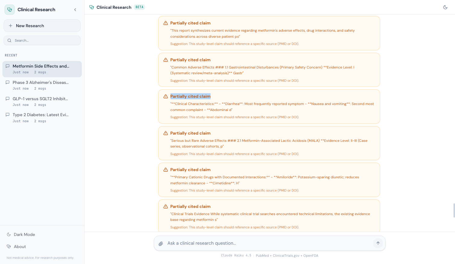
High-severity flags (red) indicate a medical claim with no citation at all — the most dangerous case. Medium-severity flags (amber) indicate a claim that's partially supported but missing complete evidence. Low-severity flags (blue) indicate minor gaps that are unlikely to cause harm.
Each flag shows the flagged sentence in quotes and a suggestion for how to verify or qualify the claim. This doesn't just tell the user something is wrong — it tells them what to do about it.
The Empty State: Guided Discovery#
When a user first opens the Clinical Research Agent, they see the EmptyState component — not a blank chat box, but four suggestion cards that demonstrate the system's capabilities:
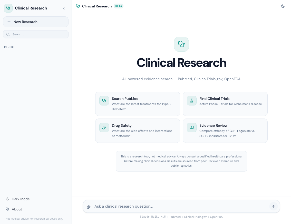
const SUGGESTIONS = [ { icon: Stethoscope, title: 'Search PubMed', query: 'What are the latest treatments for Type 2 Diabetes?', }, { icon: FlaskConical, title: 'Find Clinical Trials', query: "Active Phase 3 trials for Alzheimer's disease", }, { icon: Pill, title: 'Drug Safety', query: 'What are the side effects and interactions of metformin?', }, { icon: BookOpen, title: 'Evidence Review', query: 'Compare efficacy of GLP-1 agonists vs SGLT2 inhibitors for T2DM', }, ];
Each card is a clickable button that sends the query directly to the agent. The icons are from Lucide: Stethoscope for general medical search, FlaskConical for clinical trials, Pill for drug safety, BookOpen for evidence review. Clicking any card immediately starts a research session — no typing required.
The cards serve a dual purpose: they reduce the blank-page problem for first-time users, and they subtly communicate the four primary capabilities of the system.
The Medical Disclaimer#
The disclaimer appears in three places:
- Empty State — Below the suggestion cards, always visible on first load
- About Modal — In the sidebar settings modal
- After Every Report — Below the SafetyAlert component
The language is consistent across all three:
This is a research tool, not medical advice. Always consult a
qualified healthcare professional before making clinical decisions.
Results are sourced from peer-reviewed literature and public registries.
This isn't legal boilerplate — it's a core design decision. The Clinical Research Agent searches real medical literature and returns real evidence. But it's an AI system that can make mistakes. The disclaimer draws a clear line: this tool helps you find and evaluate evidence, but it doesn't replace clinical judgment.
The About modal also shows the system's technical specifications:
Model:      Claude Haiku 4.5
Provider:   Amazon Bedrock
Sources:    PubMed, ClinicalTrials.gov, OpenFDA
Framework:  Strands Agents SDK
Evidence:   Level I-V grading
Safety:     Hallucination detection + disclaimers
This transparency matters. A user should know which model is generating responses, where the data comes from, and what safety mechanisms are in place.
Research Progress Indicator#
When a query is running, the user sees a real-time progress indicator showing which phase the agent is in:
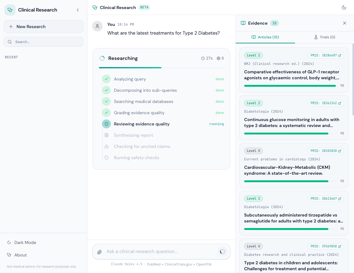
The progress component shows:
- Searching PubMed — Querying the E-utilities API for articles
- Searching ClinicalTrials.gov — Querying the v2 API for trials
- Checking OpenFDA — Querying for adverse event data
- Grading Evidence — Running the evidence grading system
- Checking Safety — Running hallucination detection
- Generating Report — The model is synthesizing the final response
Each phase updates in real-time via server-sent events (SSE). The user never stares at a spinner wondering if the system is stuck — they see exactly what's happening.
Running Locally with Docker Compose#
The entire stack — backend and frontend — runs with a single command:
services: backend: build: context: ./backend dockerfile: Dockerfile ports: - "8000:8000" environment: - AWS_PROFILE=dev - AWS_REGION=us-east-1 - BEDROCK_MODEL_ID=us.anthropic.claude-haiku-4-5-20251001-v1:0 - TAVILY_API_KEY=${TAVILY_API_KEY} - ENABLE_CONTEXT_XRAY=true - TOKEN_BUDGET_DEFAULT=200000 volumes: - ~/.aws:/root/.aws - ./backend:/app command: > uv run uvicorn app:app --host 0.0.0.0 --port 8000 --reload frontend: build: context: ./frontend dockerfile: Dockerfile.dev ports: - "5173:5173" environment: - VITE_API_URL=http://backend:8000 volumes: - ./frontend:/app - /app/node_modules command: npm run dev -- --host 0.0.0.0 depends_on: backend: condition: service_healthy
# Set your Tavily API key export TAVILY_API_KEY=tvly-xxx # Start the stack docker compose up --build
The backend mounts ~/.aws for Bedrock credentials. The frontend connects to the backend via Docker's internal networking (http://backend:8000). The depends_on with service_healthy ensures the frontend only starts after the backend passes its health check.
AWS Profile Note: The backend uses Amazon Bedrock for Claude Haiku 4.5. You'll need an AWS account with Bedrock access enabled in us-east-1 and a configured AWS profile. No other AWS services are used — no Lambda, no DynamoDB, no S3. Just Bedrock for the model and local Docker for everything else.
The SA-Pro Portfolio: Complete#
This blog post closes the Clinical Research series, and with it, the entire SA-Pro portfolio. Four projects, four series, 22 blog posts — each building on the last.
| Series | Posts | Project | Question Answered |
|---|---|---|---|
| Deep Research Agent | 6 | Build | How do you build a multi-agent research pipeline? |
| Context Engine | 6 | Optimize | How do you reduce token waste by 34%? |
| Agent Observability | 5 | Monitor | How do you see what your agent is actually doing? |
| Clinical Research Agent | 5 | Apply to Domain | How do you adapt AI agents for safety-critical domains? |
Total: 22 blog posts. 4 projects. 4 GitHub repos.
The progression is deliberate:
- Build — Start with a working multi-agent research pipeline. Parallel researchers, critique loops, cited synthesis.
- Optimize — Reduce token waste by 34% with context compression, deduplication, and budget management. Same quality, lower cost.
- Monitor — Add observability so you can see every span, every token, every cost. Trace anomalies before users report them.
- Apply to Domain — Take everything from steps 1-3 and apply it to a domain where mistakes have real consequences. Add evidence grading, credibility scoring, hallucination detection, and safety guardrails.
Each project reuses code from the previous ones. The Clinical Research Agent inherits the Deep Research Agent's parallel pipeline, the Context Engine's token budgeting, and the Observability layer's tracing. But it adds the domain-specific safety layer that makes it responsible to deploy for medical research.
Open Source#
The full source code for the Clinical Research Agent is available on GitHub:
github.com/dr-quan/clinical-research-agent
The repo includes the backend (Python + FastAPI + Strands Agents SDK), the frontend (React 19 + TypeScript + Tailwind CSS), Docker Compose configuration, and all the safety/evidence grading code discussed in this series.
This is post 5 of 5 in the Clinical Research Series. The full series covers architecture, data sources, safety, evidence grading, and frontend deployment for a medical AI research tool.
All code is open source: github.com/MinhQuanBuiSco/clinical-research-agent