Aurora Market Series — Blog 6: Editorial Aesthetic for an AI Storefront#
The default visual language for "AI app" in 2026 is well-established. Purple-to-blue gradients. Glass-morphism cards. A typing animation underneath a chat bubble. Three font weights of Inter. A sidebar with a list of past conversations. It works for a research assistant. It is the wrong signal for a retail storefront.
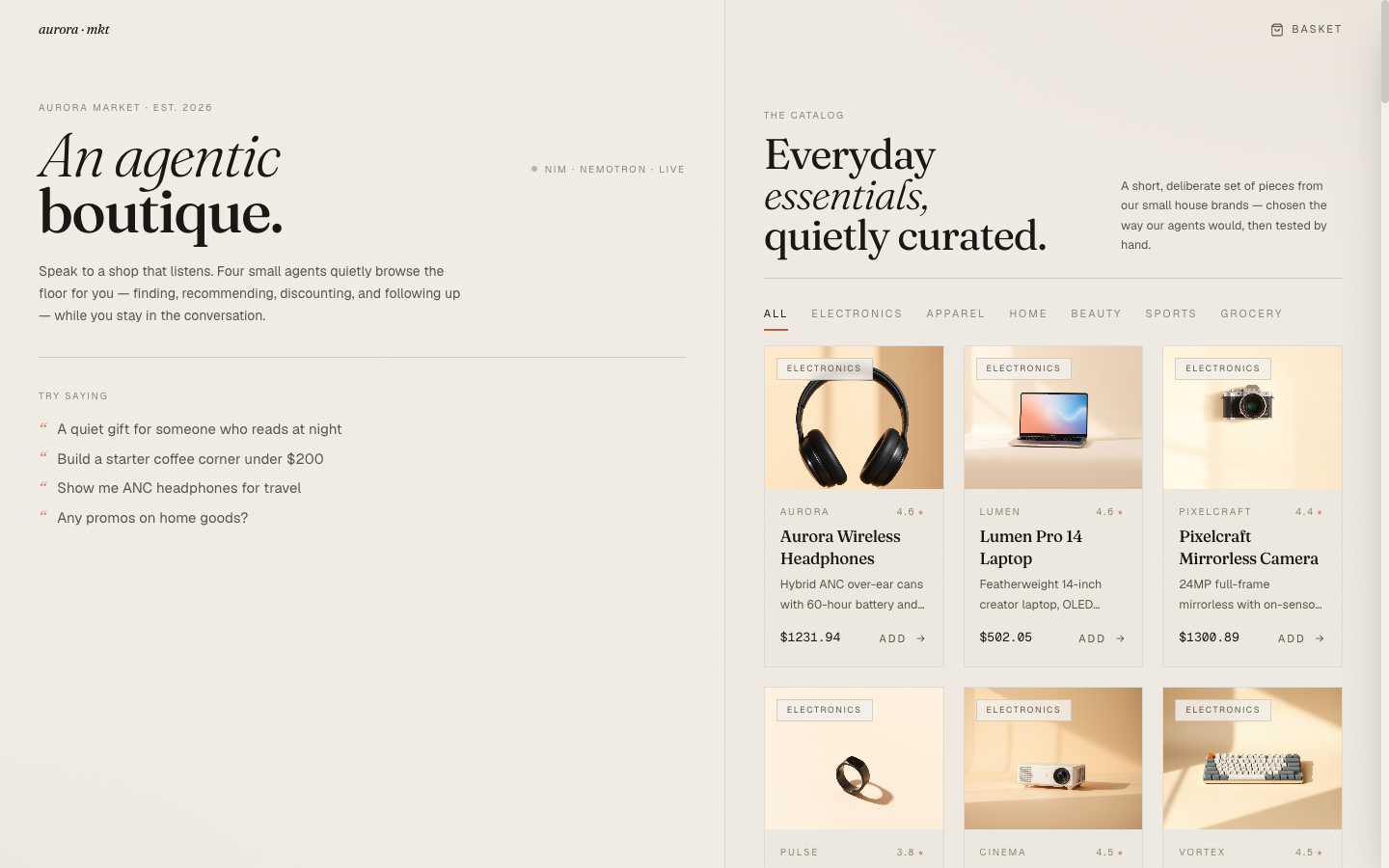
Aurora Market sells curated everyday goods. The aesthetic reference for that is not "AI tool." It's Aesop, Apple, Glossier — boutique brands where the storefront is part of the product. Generous whitespace. Serif headlines. A single warm accent color. The chat interface should sit inside that aesthetic, not the other way around.
The design decisions below are what kept the chat from looking like ChatGPT pasted onto a Shopify template.
The Aurora Market Series#
| Part | Title | Focus |
|---|---|---|
| 1 | Architecture & The Agentic Commerce Bet | Four specialists, NIM as inference, ACP-style checkout |
| 2 | Four Specialists, One Tool-Calling Loop | The base loop, per-agent prompts, cart context as a tool |
| 3 | The Router That Wouldn't Route + the Nemotron <think> Trap | LLM router + keyword backstop, reasoning-mode reply truncation |
| 4 | Realtime: SSE, Live Agent Chips, and Token Streams | SSE-over-POST events, in-flight pills, React reducer pattern |
| 5 | Generating the Catalog: Picsum → LoremFlickr → FLUX.1-schnell | Three iterations of thumbnail accuracy |
| 6 | Editorial Aesthetic for an AI Storefront (this post) | Fraunces + Geist, clay + sage, the agent chip as a transparency device |
The Typography Decision#
The single highest-leverage design choice in this project was the typeface pair.
- Display: Fraunces. A variable serif with strong editorial character — wide stylistic range from a quiet roman to a dramatic italic. The italic in particular reads as boutique-magazine rather than e-commerce. Used for the landing wordmark, all section headlines, and every product name.
- Body: Geist. A geometric sans from Vercel that's clean and modern without being generic the way Inter has become. The numerics are tabular, which matters for price displays. Used for all running text, button labels, eyebrow labels.
- Mono: Geist Mono. For codes, prices, vault tokens, tracking numbers — anywhere the user is reading something that should look tabular and exact.
// tailwind.config.js fontFamily: { display: ['Fraunces', 'ui-serif', 'Georgia', 'serif'], sans: ['Geist', 'ui-sans-serif', 'system-ui', 'sans-serif'], mono: ['Geist Mono', 'ui-monospace', 'SFMono-Regular', 'monospace'], },
Both are loaded from Google Fonts with full opsz/weight ranges so the Fraunces axes are available for fine-tuning at different sizes. The variable opsz axis is what makes the landing wordmark work — at 64px display size, the serif character is dialed up; at 17px on a product card name, it's quieter and reads as a refined title face rather than a heavy magazine display.
The hero on the landing page uses the Fraunces italic at 64px with a font-weight of 300:
<h1 className="display text-[64px] leading-[0.9] tracking-tight"> <em className="italic font-light">An agentic</em> <br /> <span className="font-medium">boutique.</span> </h1>
The italic-then-roman pairing — "An agentic / boutique." — is the single most distinctive piece of typography on the site. It reads as "magazine cover" rather than "app dashboard," which is exactly the genre the project is targeting.
The Color Palette#
colors: { bone: '#F2EFE8', // warm off-white background 'bone-deep': '#EBE6DA', // subtle card backgrounds shell: '#E2DBC9', // image placeholders ink: '#1A1815', // primary text 'ink-soft': '#5A554A', // secondary text 'ink-mute': '#8A8478', // tertiary text clay: '#B5613E', // primary accent — dusty terracotta 'clay-soft': '#D89A7E', // hover / softer accent sage: '#8A9778', // secondary accent — muted green moss: '#5C6B4F', // deeper sage }
Three things are deliberate.
No pure white anywhere. The background is #F2EFE8 — a warm bone tone. White against a serif headline would feel clinical; the bone tone gives the whole page a paper-like warmth that matches the editorial aesthetic. The same instinct shows up in print magazines: the page is almost never #FFFFFF.
One accent color, used sparingly. Clay (#B5613E) is the only chromatic accent the user sees on most screens. It appears on hovers, on the "consulting…" pulse dot, on the promo banner border, on the small bullet next to the chat brand mark, and on the agent chip's expanded-state caret. Everywhere else is neutral. The discipline of holding to one accent is what makes the moments where it appears feel intentional.
Sage as a secondary, never a primary. Sage shows up on the order-confirmation icon and on the "NIM · nemotron · live" status dot — moments that are complete or running healthily. It never appears on a CTA. Splitting accents by semantic role (clay = action, sage = state) means the user reads color the same way every time.
The paper-grain noise overlay is a small but important detail:
body::before { content: ''; position: fixed; inset: 0; pointer-events: none; opacity: 0.035; z-index: 0; background-image: url("data:image/svg+xml;utf8,<svg ...feTurbulence...>"); }
3.5% opacity over the entire viewport. Invisible until you look for it; the texture is what makes the bone background feel like paper rather than a flat color.
The Chat-as-Storefront Layout#
The page is a single screen split roughly 55/45 between the chat panel (left) and the catalog grid (right). On either side, the user can drive the same outcome — talk to the agents, or browse the grid directly. The cart drawer slides in from the right when needed.
<main className="relative grid grid-cols-1 lg:grid-cols-[1.05fr_0.95fr] min-h-screen"> <div className="relative border-r border-ink/10 pt-16"> <Chat ... /> </div> <div className="relative pt-16 bg-bone-deep/30"> <Catalog ... /> </div> </main>
Why both, instead of pushing the user into one mode?
A chat-only interface forces every interaction through language, which is great for intent ("I need ANC headphones under $300") and terrible for browsing ("…what do you have?"). A grid-only interface is the opposite. The honest answer is that some shopping is verbal and some is visual, and you don't want to make the user pick the wrong mode for their question.
The interesting thing this layout enables is that chat replies surface products as cards directly under the assistant message (Blog 4 walks through how those land via the SSE products event). When the search agent returns six hits, the user sees both the agent's prose answer and a horizontal scrolling row of cards they can add from. The chat doesn't replace the catalog; it indexes into it.
The Agent Chip as a Transparency Device#
This is the single most opinionated UI choice in the project, and the one I think generalizes best.
Every assistant reply renders a small chip below the prose for each agent that ran. The chip is closed by default — a dot in the agent's category color, the agent name in small caps, a chevron. Click it, and the chip expands to show the agent's summary and the actual tool calls it made (function name, arguments, truncated result preview).
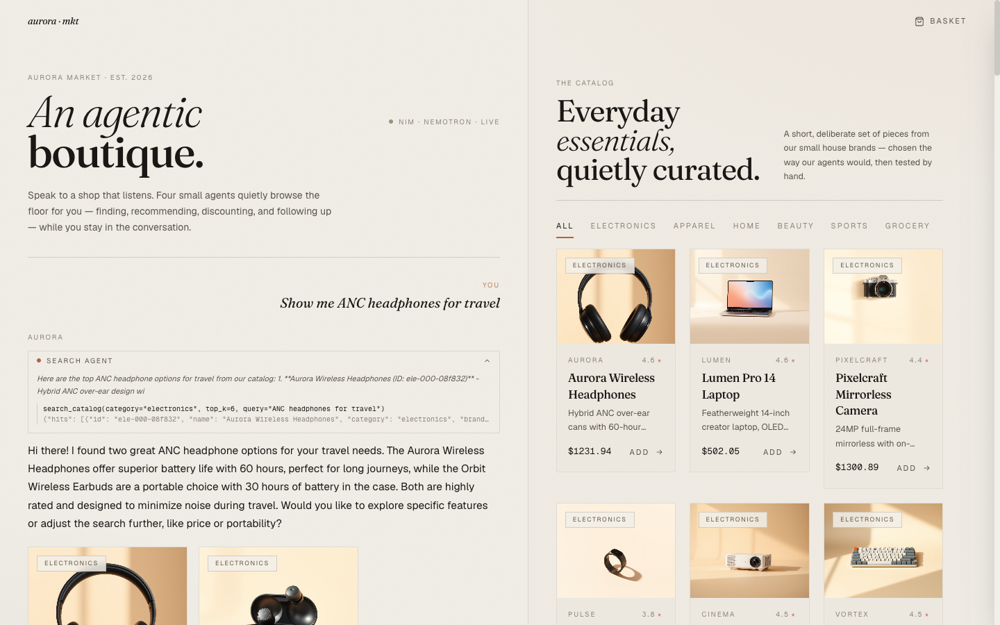
Three things are happening with this UI element.
It makes the agentic part legible. Most "AI shopping" products today don't tell the user that they're talking to anything specific. The interaction is opaque: you ask, an answer arrives. Aurora Market's chips make the agentic structure visible — "search agent ran, then promotion agent ran" — which is honest to what's actually happening and helps the user form a mental model of what to ask for.
It's a debug surface in production. When the agent recommends something odd, the user can open the chip and see the actual query the agent embedded. Sometimes the query is clearly wrong ("the agent searched for 'travel' instead of 'noise-cancelling headphones for travel'") and the user can refine their next ask. This kind of transparency is usually buried in dev tools; surfacing it inline turns it into a UX feature.
It's the one moment of "AI" the design indulges. The rest of the page is editorial neutral. The expanded chip is mono-font, slightly technical, deliberately a different register from the prose. That contrast is what makes the chip feel intentional rather than decorative — it's a window into the system underneath, framed as such.
The implementation is small:
export function AgentChip({ event }: { event: AgentEvent }) { const [open, setOpen] = useState(false); const calls = event.payload?.tool_calls as Array<{ name: string; args: unknown; result_preview: string }> | undefined; return ( <div className="border border-ink/10"> <button onClick={() => setOpen(o => !o)} className="flex items-center gap-2 px-3 py-1.5 w-full text-[10px] uppercase tracking-crawl text-ink-soft hover:bg-bone-deep"> <span className={`h-1.5 w-1.5 rounded-full ${DOT_COLOR[event.agent]}`} /> <span>{LABEL[event.agent]}</span> <ChevronDown size={11} className={`ml-auto transition-transform ${open ? 'rotate-180' : ''}`} /> </button> {open && ( <div className="px-3 pb-3 pt-1 text-[11px] text-ink-soft animate-fadein"> {event.summary && <p className="italic mb-2">{event.summary}</p>} {calls?.map((c, i) => ( <li key={i} className="border-l border-ink/15 pl-2 font-mono text-[10px]"> <div className="text-ink">{c.name}({prettifyArgs(c.args)})</div> <div className="text-ink-mute truncate">{c.result_preview}</div> </li> ))} </div> )} </div> ); }
Micro-Interactions That Carry Weight#
A few small motions do disproportionate work for the perceived quality.
Product card image scale on hover. Each card image animates from scale(1.0) to scale(1.04) over 1400ms with cubic-bezier(0.22, 1, 0.36, 1). The duration is deliberately slow — at 300ms it would feel snappy in a wrong-genre way; at 1400ms it reads as a subtle reveal rather than a UI tic. The add-to-cart button below the image fades in only on hover; without that, every card has a permanent CTA which competes with the brand restraint.
Staggered card rise on grid entry. Products animate in with a translateY(6px) → 0 over 550ms, with each card delayed by (i % 12) * 30ms. The result is a wave of cards rising rather than a static grid materializing. It's the kind of detail you notice on the first page load and then your eye moves on — which is exactly the right weight for a motion effect on a grid.
Cart drawer slide. The drawer enters with translateX(100%) → 0 over 450ms, with the backdrop fading in over 500ms behind it. Cubic-bezier-eased, not linear. The longer-than-snappy duration matches the editorial register — the drawer is something arriving, not something appearing.
The chat caret. While the composer streams (Blog 4), a thin pulsing caret renders at the end of the current text:
{turn.streaming && ( <span className="inline-block w-[2px] h-[1em] align-[-2px] ml-[2px] bg-ink/60 animate-pulse" /> )}
The caret is 2px wide, 1em tall, ink-colored at 60% opacity. It pulses with Tailwind's animate-pulse. Tiny detail, but it's the difference between "text is appearing magically" and "the system is typing this to me right now."
The Cart Drawer#
The cart is its own small editorial moment. Editorial header ("Your basket / 3 pieces" with italic serif numbers), monospace prices, a single CTA at the bottom, no promotional banners.
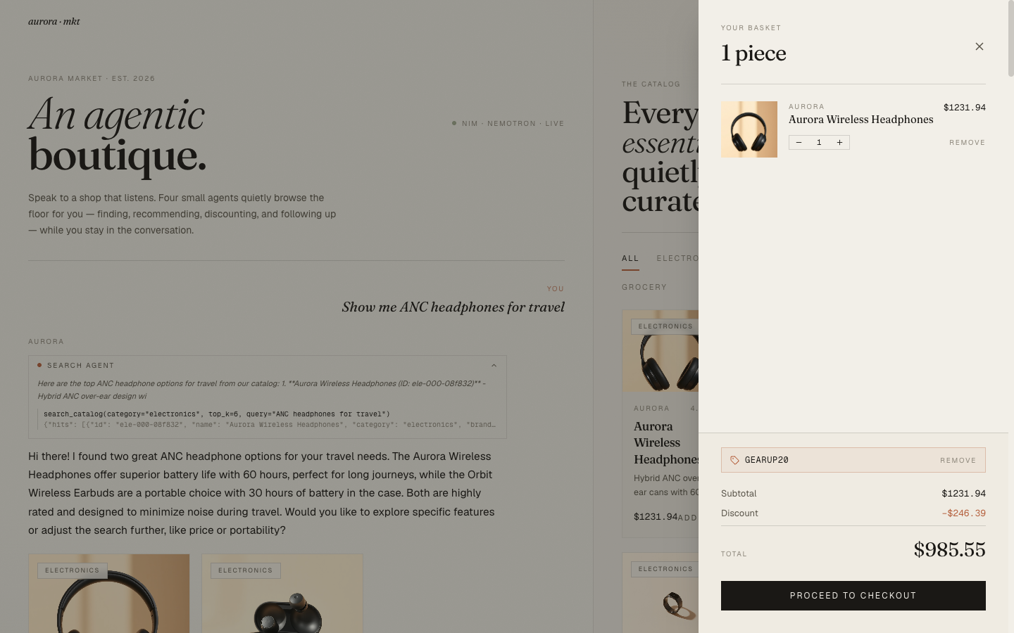
Two design decisions worth pulling out.
The promo input is a hairline-bordered field, not a button-and-input pair. When no promo is applied, the user sees a single field with "Apply" as a text link at the right. When a promo is applied, the field is replaced by a small chip showing the code and a "Remove" link. The state change is communicated by replacement, not by toggling a "applied/not applied" indicator next to a permanent field. That keeps the drawer visually quiet in both states.
Quantity controls are bordered, not pilled. A 1px hairline border around [− 1 +] with a hover state that fills each button with ink. The pilled rounded-corner version felt too app-y; the hairline reads as editorial restraint.
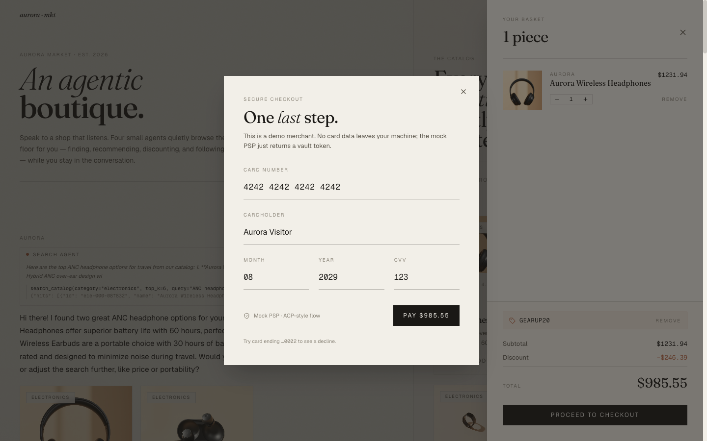
The Checkout Modal#
The mock PSP flow (Blog 1) closes in a single modal. Editorial header — "One last step." with italic serif on "last" — then a hairline-bordered form. The card number defaults to 4242 4242 4242 4242 and the helper text at the bottom invites the user to try a ...0002 card to see the decline path.
The successful path drops into an order confirmation:
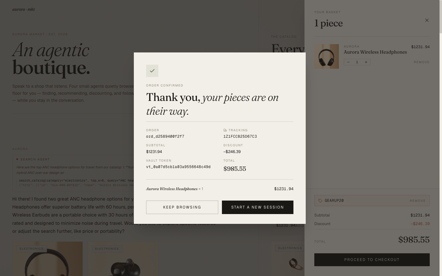
The "vault token" line is shown deliberately. It's a small technical artifact of the ACP-style flow that I wanted visible — a reminder to the user that no card data was stored, only the tokenized handle. For a real e-commerce app this would be a backend implementation detail; for a demo, surfacing it is part of the story.
What I Didn't Do#
A few defaults I considered and rejected:
- Dark mode. A boutique storefront aesthetic doesn't carry over to dark mode. The same palette inverted (
#1A1815background,#F2EFE8text) reads as luxury hotel app rather than editorial boutique. I'd rather commit to one mode and execute it well than ship two halfway. - A chat history sidebar. Common in AI apps; wrong for shopping. The user's shopping intent is per-session, not persistent. Showing yesterday's "what about a kettle?" alongside today's "I need a parka" is noise.
- A typing animation in the input bar. The "consulting…" pill above the input already conveys that the system is thinking. A dancing-dots indicator inside an empty input field would over-signal.
- Avatars. No avatar for the user, no avatar for the assistant. The
eyebrowlabels ("You" / "Aurora") are enough; a circle with initials would be a step toward a different genre.
The pattern across these is the same: every default an AI-chat template ships with is a small step away from boutique restraint. Saying no to most of them is the design.
Closing#
The interesting thing about an AI storefront is that the AI part isn't the product. The product is the items on the shelf and the way they're presented. The AI is the salesperson, and the salesperson in a good boutique is quiet, helpful, and visibly competent without being showy. The editorial design language is what makes the agents feel like they belong in the room.
If you skipped the whole series and only read this post, the takeaway is: every domain has its own native aesthetic, and the default "AI app" look obscures it. For commerce, editorial restraint is closer to right than dashboard sleekness, and "no AI clichés" is itself the brief.
The repo is at github.com/MinhQuanBuiSco/retail-agentic-commerce. Run it locally with an NVIDIA API key (free tier) and a single docker compose up --build.
References#
- NVIDIA-AI-Blueprints/Retail-Agentic-Commerce — the upstream blueprint this series follows. If you want the full multi-service version with delegated payments, protocol endpoints, and the NAT agent integration, go there first. This project is an independent, single-developer-readable reinterpretation of the same shapes.
- NVIDIA NIM API — hosted endpoints for Nemotron Nano (LLM), NV-EmbedQA-E5-v5 (embeddings), and FLUX.1-schnell (catalog photos). Free tier is enough to run the full demo end-to-end.
- Agentic Commerce Protocol (ACP) — the delegated-checkout pattern the mock PSP in this project follows.