Agent Observability Series — Blog 5: Production Dashboard & Anomaly Detection#
A dashboard that shows your agent's health at a glance -- latency p50/p95/p99, quality scores trending, cost per hour, and red alerts when something breaks. That is what we build in this final post.
But a dashboard that only shows current values is a monitoring screen. A dashboard that tells you when values are abnormal is an observability system. So we pair it with a Z-score anomaly detector that maintains a sliding window of recent metrics and flags anything that deviates too far from the mean. Latency jumped to 345 seconds when the average is 42? That is 2.34 standard deviations above normal -- critical alert. Cost hit $0.051 when the average is $0.028? That is 1.61 standard deviations -- warning.
The detector does not need thresholds you configure. It learns what "normal" looks like from your own data and tells you when something does not fit.
The Agent Observability Series#
| Part | Title | Focus |
|---|---|---|
| 1 | Architecture & OpenTelemetry Foundations | System design, gen_ai.* conventions, span model |
| 2 | Tracing Multi-Agent Research Pipelines | Hierarchical traces, TraceCollector, dashboard API |
| 3 | Automated Evaluation with LLM-as-Judge | 5-criteria scoring, quality trends |
| 4 | Token Cost Tracking & Budget Alerts | Per-model pricing, stage breakdown, budget alerts |
| 5 | Production Dashboard & Anomaly Detection (this post) | 4-panel dashboard, Z-score anomaly detection |
Anomaly Detection with Z-Scores#
The idea is simple. Maintain a sliding window of recent values for each metric. Compute the mean and standard deviation. When a new value arrives, calculate how many standard deviations it is from the mean. If it is far enough, flag it.
The Anomaly Dataclass#
Each detected anomaly is a structured record:
@dataclass class Anomaly: """A detected anomaly.""" metric: str # "latency" or "cost" or "quality" value: float z_score: float mean: float std_dev: float threshold: float severity: str # "warning" or "critical" message: str timestamp: str = "" query: str = "" def to_dict(self) -> dict: return { "metric": self.metric, "value": round(self.value, 4), "z_score": round(self.z_score, 2), "mean": round(self.mean, 4), "std_dev": round(self.std_dev, 4), "severity": self.severity, "message": self.message, "timestamp": self.timestamp, "query": self.query, }
The z_score field is the key piece of context. When an operator sees "latency 345s is critical," their first question is "how critical?" The z-score answers that: 2.34 means the value is 2.34 standard deviations above normal. That is not just high -- it is statistically unusual given recent behavior.
The AnomalyDetector Class#
class AnomalyDetector: """Detects anomalies in agent metrics using Z-score analysis. Maintains a sliding window of recent values for each metric. Flags values that are 2sigma+ (warning) or 3sigma+ (critical) from the mean. """ def __init__(self, window_size: int = 50, warning_threshold: float = 2.0, critical_threshold: float = 3.0): self.window_size = window_size self.warning_threshold = warning_threshold self.critical_threshold = critical_threshold self._windows: dict[str, list[float]] = { "latency": [], "cost": [], "quality": [], } self._anomalies: list[Anomaly] = [] self._max_anomalies = 100
Three metrics, three sliding windows. The default thresholds are 2.0 (warning) and 3.0 (critical). For a normal distribution, 2 sigma captures 95.4% of values and 3 sigma captures 99.7%. A value beyond 3 sigma has a 0.3% chance of occurring naturally -- that is worth investigating.
The window size of 50 means the detector adapts to recent behavior. If your agent's latency gradually increases over 50 queries (maybe the search API is slowing down), the detector adjusts its baseline. It only fires when a value is anomalous relative to recent history, not relative to some hardcoded threshold.
The check() Method#
This is where the math happens:
def check(self, metric: str, value: float, query: str = "") -> Anomaly | None: if metric not in self._windows: self._windows[metric] = [] window = self._windows[metric] window.append(value) # Keep window bounded if len(window) > self.window_size: window.pop(0) # Need at least 5 data points for meaningful stats if len(window) < 5: return None mean = sum(window) / len(window) variance = sum((x - mean) ** 2 for x in window) / len(window) std_dev = math.sqrt(variance) if variance > 0 else 0 if std_dev == 0: return None z_score = (value - mean) / std_dev # For quality, anomaly is BELOW mean (low quality is bad) if metric == "quality": z_score = -z_score # Invert so positive = anomalous if abs(z_score) >= self.critical_threshold: severity = "critical" elif abs(z_score) >= self.warning_threshold: severity = "warning" else: return None anomaly = Anomaly( metric=metric, value=value, z_score=z_score, mean=mean, std_dev=std_dev, threshold=self.critical_threshold if severity == "critical" else self.warning_threshold, severity=severity, message=self._format_message(metric, value, mean, severity), timestamp=datetime.now(timezone.utc).isoformat(), query=query[:80], ) self._anomalies.insert(0, anomaly) if len(self._anomalies) > self._max_anomalies: self._anomalies = self._anomalies[:self._max_anomalies] return anomaly
Several design decisions here:
Minimum 5 data points. With fewer than 5 values, the standard deviation is meaningless. The detector stays silent during warmup and only begins flagging after it has enough history to compute stable statistics.
Zero standard deviation check. If all values in the window are identical (std_dev = 0), every new value is either identical (not anomalous) or the first different value (which would produce an infinite z-score). We return None to avoid division by zero.
Quality inversion. For latency and cost, higher values are bad. For quality, lower values are bad. Inverting the z-score for quality means a positive z-score always indicates "anomalous in the bad direction" regardless of the metric.
History cap at 100. The anomaly list caps at 100 entries to prevent unbounded memory growth. Oldest anomalies fall off as new ones arrive.
Human-Readable Messages#
The _format_message() method produces messages that make sense at a glance:
def _format_message(self, metric: str, value: float, mean: float, severity: str) -> str: if metric == "latency": return f"Latency {value:.0f}ms is {severity} — avg is {mean:.0f}ms" elif metric == "cost": return f"Cost ${value:.4f} is {severity} — avg is ${mean:.4f}" elif metric == "quality": return f"Quality score {value:.1f}/5 is {severity}ly low — avg is {mean:.1f}/5" return f"{metric} value {value} is {severity}"
"Latency 345000ms is critical -- avg is 42000ms." No ambiguity. You know what happened, how bad it is, and what normal looks like, in one line.
Seeding from Historical Traces#
On server restart, the sliding windows are empty. The first 5 queries produce no anomaly checks. To avoid this cold-start gap, the dashboard API seeds the detector from stored traces:
# In dashboard_api.py — on startup for trace in collector.get_recent_traces(): detector.check("latency", trace.duration_ms) detector.check("cost", trace.total_cost)
This pre-fills the windows so the detector is immediately operational after a restart. Past anomalies are not re-flagged because the check is sequential -- by the time it reaches recent values, the window has enough history to compute accurate statistics.
A Real Anomaly from Our Tests#
During testing, we triggered a genuine anomaly by running a complex comparison query ("Compare all major cloud providers for enterprise AI workloads") while the search API was slow:
Anomaly detected:
  metric: latency
  value: 345,000 ms (345 seconds)
  z_score: 2.34
  mean: 42,000 ms
  std_dev: 129,000 ms
  severity: critical
  message: "Latency 345000ms is critical — avg is 42000ms"
The same query also triggered a cost warning:
Anomaly detected:
  metric: cost
  value: $0.0510
  z_score: 1.61 (below critical, but above warning)
  mean: $0.0280
  std_dev: $0.0143
  severity: warning
  message: "Cost $0.0510 is warning — avg is $0.0280"
The latency was critical (z=2.34, above the 2.0 threshold) because 345 seconds is dramatically slower than the 42-second average. The cost was only a warning (z=1.61) because the cost increase was proportional -- more tokens processed, but at the same per-token rate. The detector correctly identified that latency was the real problem, not cost.
The Dashboard Frontend#
The dashboard is a standalone page at /dashboard with a 4-panel grid layout. Each panel is a self-contained component receiving data from the DashboardPage parent.
DashboardPage: Data Fetching#
The page fetches all data from 5 API endpoints using Promise.allSettled:
const fetchData = useCallback(async () => { const [tracesRes, evalsRes, costRes, anomaliesRes, statsRes] = await Promise.allSettled([ fetch('/api/dashboard/traces'), fetch('/api/dashboard/evaluations'), fetch('/api/dashboard/cost'), fetch('/api/dashboard/anomalies'), fetch('/api/dashboard/stats'), ]); // Parse each response, falling back to empty defaults... setData({ traces, evaluations, cost, anomalies, summary }); setLastRefresh(new Date()); }, []);
Promise.allSettled is critical here. If the traces endpoint is down, we still want cost and anomaly data. Each response is checked individually -- a failed fetch produces an empty default, not a crashed dashboard.
Auto-Refresh#
The dashboard refreshes every 10 seconds:
const REFRESH_INTERVAL = 10_000; useEffect(() => { fetchData(); const interval = setInterval(fetchData, REFRESH_INTERVAL); return () => clearInterval(interval); }, [fetchData]);
Ten seconds is a balance between freshness and API load. During active research, you see new traces within 10 seconds of completion. The refresh icon in the header spins during fetches, and the "updated HH:MM:SS" timestamp shows when data was last loaded.
Summary Stats Bar#
Four stat cards across the top provide the executive summary:
<div className="grid grid-cols-2 gap-3 md:grid-cols-4"> <StatCard icon={Activity} label="Total Traces" value={String(summary.total_traces)} index={0} /> <StatCard icon={Clock} label="Avg Latency" value={formatLatency(summary.avg_latency_ms)} index={1} /> <StatCard icon={Star} label="Avg Quality" value={`${summary.avg_quality.toFixed(1)}/5`} index={2} /> <StatCard icon={DollarSign} label="Daily Cost" value={`$${summary.daily_cost.toFixed(2)}`} index={3} /> </div>
Each card animates in with a staggered delay (index * 0.05), creating a left-to-right cascade effect. The formatLatency helper shows milliseconds for values under 1 second and seconds for larger values -- "42ms" vs. "3.4s".
The 4-Panel Grid#
Below the stats, four panels fill the screen in a 2x2 grid:
<div className="grid grid-cols-1 gap-4 md:grid-cols-2" style={{ minHeight: '60vh' }}> {/* Top-left: Trace Waterfall */} <TraceWaterfall spans={data?.traces?.spans ?? []} totalDuration={data?.traces?.totalDuration ?? 0} /> {/* Top-right: Quality Chart */} <QualityChart evaluations={data?.evaluations ?? []} /> {/* Bottom-left: Cost Breakdown */} <CostBreakdown data={data?.cost ?? null} /> {/* Bottom-right: Alert Panel */} <AlertPanel anomalies={data?.anomalies ?? []} /> </div>
Each panel is wrapped in a motion.div with staggered entry animations (delays 0.1, 0.15, 0.2, 0.25 seconds). The grid is responsive -- single column on mobile, 2x2 on desktop.
Panel 1: TraceWaterfall#
The top-left panel shows the most recent trace as a hierarchical span view. Each span is a horizontal bar whose width is proportional to its duration relative to the total trace duration. Parent spans contain child spans, creating a nested waterfall that visualizes the pipeline's execution flow:
- Research (parent span, full width)
- query_decomposition (short bar, early in the timeline)
- parallel_research (long bar, multiple child spans for each sub-query)
- deduplication (short bar)
- critique (medium bar)
- synthesis (medium bar)
The waterfall immediately answers "where did the time go?" If parallel_research takes 80% of the trace duration, you know the search API is the bottleneck, not your synthesis prompt.
Panel 2: QualityChart#
The top-right panel shows quality evaluation scores across the 5 criteria from the LLM-as-judge system (Blog 2): accuracy, completeness, relevance, citations, and clarity. Each criterion is a horizontal bar from 0 to 5, color-coded by score -- green for 4+, amber for 3-4, red below 3.
Multiple evaluations stack to show trends. If accuracy scores are consistently 4.5 but citations keep dropping to 3.0, you know exactly which aspect of output quality needs attention.
Panel 3: CostBreakdown#
The bottom-left panel is the CostBreakdown component from Blog 4 -- budget progress bar, stage breakdown with stacked bar chart, and the top 5 most expensive queries. The budget bar turns red above 80% spend, giving immediate visual feedback on daily budget health.
Panel 4: AlertPanel#
The bottom-right panel shows anomaly alerts from the Z-score detector:
export function AlertPanel({ anomalies }: AlertPanelProps) { const criticalCount = anomalies.filter((a) => a.severity === 'critical').length; const warningCount = anomalies.filter((a) => a.severity === 'warning').length; return ( <div className="rounded-2xl border border-border bg-card p-5 h-full flex flex-col"> <div className="mb-4 flex items-center justify-between"> <div className="flex items-center gap-2.5"> <Bell className="h-4 w-4 text-primary" /> <span className="font-serif text-base text-foreground">Alerts</span> {anomalies.length > 0 && ( <span className="rounded-full bg-red-500/15 px-2 py-0.5 text-[10px] font-bold text-red-500 font-mono"> {anomalies.length} </span> )} </div> </div> {/* Alert list */} </div> ); }
When there are no anomalies, the panel shows a green checkmark with "All systems normal." When anomalies exist, each one renders as a card with a severity icon (red XCircle for critical, amber AlertTriangle for warning), the human-readable message, the z-score, timestamp, and the query that triggered it.
Critical alerts have a red border and background tint. Warnings use amber. The visual distinction is immediate -- a dashboard full of green checkmarks means everything is fine. A red card demands attention.
Each alert shows three pieces of context in a compact footer:
<div className="mt-1.5 flex items-center gap-3 text-[10px] font-mono text-muted-foreground"> <span>{alert.metric}</span> <span>z={alert.z_score.toFixed(1)}</span> <span>{formatTimestamp(alert.timestamp)}</span> </div>
The metric name, z-score, and timestamp. An operator sees "latency z=2.3 14:32" and immediately knows: latency anomaly, 2.3 standard deviations, happened at 2:32 PM.
Navigation: Chat and Dashboard#
The dashboard header includes a "Back to chat" link that returns to the main research interface:
<a href="/" className="flex items-center gap-1.5 text-sm text-muted-foreground hover:text-foreground"> <ArrowLeft className="h-4 w-4" /> <span>Back to chat</span> </a>
From the chat page, a dashboard link navigates to /dashboard. The two views are complementary: the chat page is where you use the agent, the dashboard page is where you monitor it. During active research, you can switch between them to watch traces populate, quality scores arrive, and cost accumulate in real time.
What It Looks Like#
Dashboard with Active Alerts#
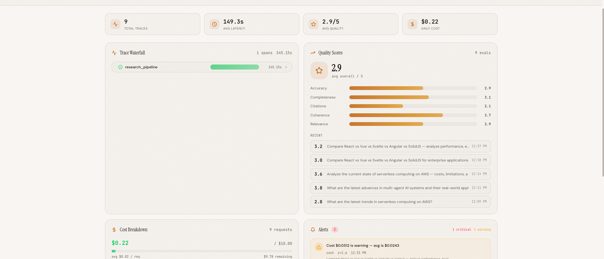 The 4-panel dashboard during active monitoring -- trace waterfall (top-left), quality chart (top-right), cost breakdown (bottom-left), and alert panel with a critical latency anomaly (bottom-right)
Full Dashboard View#
 Full dashboard view showing summary stats, all four panels, and the auto-refresh indicator in the header
The Trilogy Complete#
This post concludes both the Agent Observability series and a larger trilogy of 17 blog posts across three projects:
Deep Research Agent (6 posts): Build the Agent#
We built a multi-agent research system from scratch -- architecture design, search tool integration, parallel orchestration, real-time streaming, AWS infrastructure, and security hardening. The result: an agent that decomposes complex queries, dispatches parallel researchers, deduplicates findings, runs a critique loop, and synthesizes a cited report.
Context Engine (6 posts): Optimize Token Usage#
We layered a context engineering pipeline on top of the agent -- query complexity classification, result compression, semantic memory caching, dynamic tool selection, source deduplication, and a Context X-ray visualization. The result: 34% fewer tokens on complex queries with no quality loss.
Agent Observability (5 posts): Monitor Everything#
We added full observability -- OpenTelemetry tracing with gen_ai.* conventions, LLM-as-judge automated evaluation, real-time WebSocket streaming, per-model cost tracking with budget alerts, and a production dashboard with Z-score anomaly detection. The result: you can see every span, score every response, track every cent, and get alerted when something breaks.
Together, these three layers form a complete stack: build an AI agent, optimize its context usage, and monitor it in production. Each layer was built incrementally, each technique was explained with real code and real numbers, and each component is open source.
The philosophy throughout has been the same: no magic, no frameworks, no abstractions hiding the work. Every technique is explicit Python or TypeScript, every decision is explained, every tradeoff is visible. You can read the code, understand the math, and adapt it to your own agents.
All code is open source: github.com/MinhQuanBuiSco/agent-observability